Apple’s Cosmic Orange iPhone 17 Pro Turns Heads at Launch
Key Points
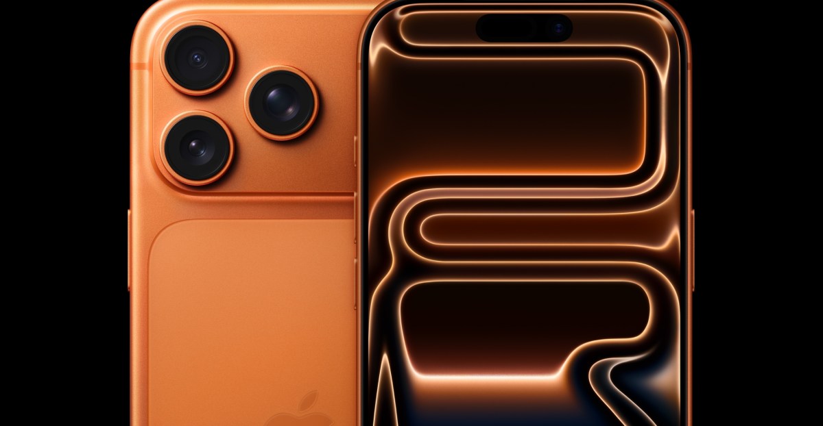
- Apple launches iPhone 17 Pro in a new "cosmic orange" shade.
- The color wraps the aluminum body and camera bump, with a lighter tone on the glass back.
- Orange aligns with recent runway fashion trends and summer color palettes.
- Taylor Swift’s recent orange‑themed tour looks and album branding echo the phone’s hue.
- Early reviewers praise the vibrancy and premium feel of the new color.
- Silver and deep‑blue remain as alternative finishes; black is not offered.
- Apple’s bold color choice may signal future design experiments.
Apple introduced a bold new hue for its flagship iPhone 17 Pro: a deep, “cosmic orange” that wraps the aluminum body and camera bump. The shade aligns with current fashion runway trends and summer color palettes, and its timing coincides with pop‑culture moments such as Taylor Swift’s recent orange‑themed tour outfits. Reviewers praise the color’s vibrancy and its ability to stand out on a table, while the more muted silver and deep‑blue options provide alternatives. The launch marks a rare instance of Apple using a high‑impact color as its hero shade for a Pro model.
Apple’s Bold Color Choice
At its latest product event, Apple unveiled the iPhone 17 Pro in a striking new shade dubbed “cosmic orange.” The color envelops the device’s unibody aluminum frame and extends across the raised camera module, while the glass back features a slightly lighter tint. This deliberate design decision makes the phone instantly recognizable in a sea of devices.
Alignment With Fashion Trends
The orange finish taps into broader style movements. Fashion runways earlier this year featured prominent orange tones, and summer trend reports highlighted citrus hues as a seasonal favorite. By selecting this shade, Apple positions the iPhone 17 Pro as a fashion‑forward accessory that mirrors contemporary color preferences.
Cultural Sync With Taylor Swift
Beyond runway influence, the color resonates with pop culture. Taylor Swift’s recent tour wardrobe showcased abundant orange, and her upcoming album’s visual branding emphasizes the same hue. The convergence of Apple’s launch timing and Swift’s branding amplifies the color’s visibility across entertainment and tech spheres.
Reception From Early Reviewers
Initial impressions praise the cosmic orange for its vividness and premium feel. Reviewers note that the hue “pops” on display surfaces, making the phone stand out during demonstrations and in everyday use. The unibody aluminum construction ensures the color wraps seamlessly around the device, while the slight gradient on the glass back adds depth.
Alternative Color Options
Apple also offers the iPhone 17 Pro in silver and deep‑blue. These more subdued tones provide choices for consumers who prefer classic aesthetics. Notably, a traditional black option is absent, marking a shift away from the most conventional Pro color.
Implications for Future Designs
The decision to spotlight a bold color suggests Apple may continue experimenting with high‑impact finishes in upcoming releases. By aligning product design with prevailing fashion and cultural cues, Apple reinforces its reputation for merging technology with lifestyle trends.